Dark spirits present one of the most technically challenging yet visually rewarding subjects in product photography. The amber depths of aged whisky, the rich mahogany tones of cognac, the warm complexity of rum—these spirits demand a photographer who understands both the technical requirements and the emotional storytelling needed to capture luxury in a bottle.
After years photographing premium spirits for brands like Rémy Martin and Hibiki Suntory, we’ve learned that successful dark spirits photography isn’t about following a formula. It’s about understanding how light interacts with liquid, glass, and the story each bottle tells. The difference between a competent product shot and an image that makes someone reach for their wallet often comes down to mastering a few critical techniques that many photographers overlook.
Understanding the Unique Challenges of Dark Spirits
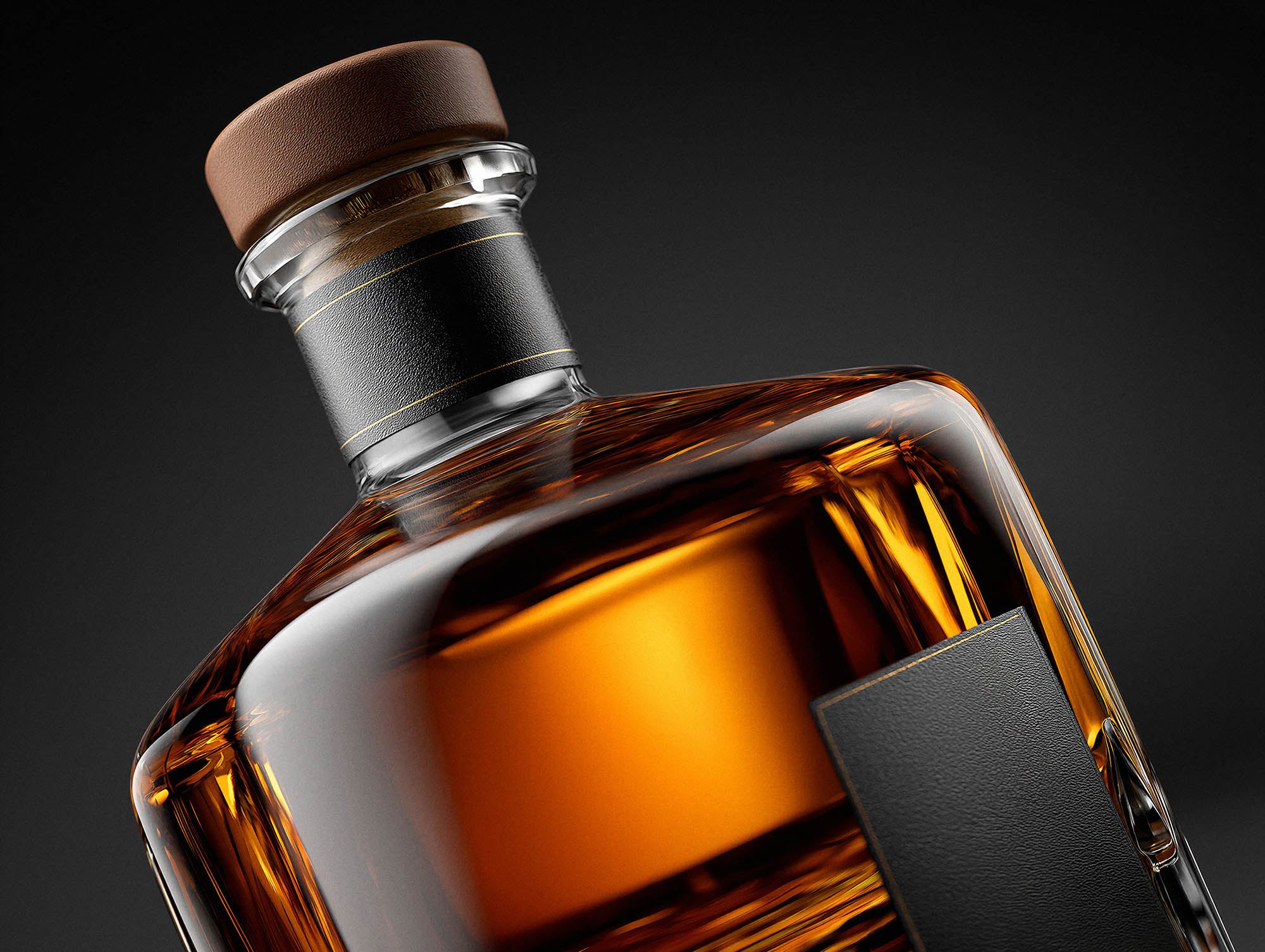
Dark spirits photography differs fundamentally from shooting clear spirits or other products. The liquid itself acts as both subject and complicating factor. You’re not just photographing a bottle—you’re capturing the way light penetrates amber liquid, revealing layers of color that range from pale gold to deep mahogany. Miss the mark on exposure by even half a stop, and you’ll either lose the liquid’s rich depth or render it as an impenetrable black mass.
The glass adds another layer of complexity. Premium spirits often come in sculptural bottles with facets, curves, and embossing that create multiple reflective surfaces. Each surface needs consideration in your lighting setup. What works beautifully for the label might create unwanted hotspots on the shoulder of the bottle. The base might need separate attention to show its weight and presence.
Then there’s the question of context. A whisky bottle photographed against pure white feels clinical, appropriate perhaps for e-commerce but missing the atmospheric quality that luxury spirits demand. Yet add too much environment, and you risk overwhelming the product. This balance—between technical precision and emotional resonance—defines exceptional dark spirits photography.
Mastering Light: The Foundation of Great Spirits Photography
Lighting dark spirits requires a completely different approach from standard product photography. The goal isn’t uniform illumination—it’s controlled, directional light that reveals form, enhances the liquid’s color, and creates the kind of dimensionality that makes an image feel three-dimensional on a flat screen.
Interactive Lighting Setup Guide
Toggle each light to see how it affects your dark spirits photography
Illuminates the liquid, creating amber glow and depth
Creates separation and defines bottle contours
Balances composition with secondary rim lighting
Subtle front illumination for label readability
Pro Tips
- Start with backlight only—it’s the foundation of dark spirits photography
- Add edge lights one at a time to see their individual contribution
- Keep fill light subtle—you want drama, not flat illumination
- All lights together create the professional result you see in premium campaigns
Ready to create stunning spirits photography for your brand?
Our team combines this technical expertise with AI enhancement for premium results.
The Beauty of Backlighting
Backlighting transforms dark spirits photography. Position your main light source behind the bottle, and suddenly that opaque amber liquid becomes luminous. The cognac in a Rémy Martin XO bottle shifts from dark brown to glowing amber with visible color gradients from the rim to the base. This technique works because you’re shooting the light passing through the liquid rather than reflecting off surfaces.
The key is controlling the intensity. Too much backlight and you blow out the liquid’s color, reducing rich mahogany to washed-out yellow. Too little and you’ve wasted the setup’s potential. We typically start with a large softbox positioned directly behind the bottle, then use black flags on either side to prevent light spill onto the front surfaces. This creates a controlled band of illumination that reveals the liquid’s depth without creating unwanted reflections on the label.
Creating Dimension with Edge Lighting
While backlight handles the liquid, edge lighting defines the bottle’s form. Position a strip light or carefully flagged softbox at a 45-degree angle from behind, and you’ll create a bright edge that traces the bottle’s contour. This separation from the background transforms a flat image into something with genuine depth.
The beauty of edge lighting is its flexibility. A single edge light on the left side of a whisky bottle creates drama and asymmetry. Add a second, dimmer edge light on the right, and you’ve built a more balanced composition that still maintains interest through lighting ratios. For bottles with complex shapes—like the faceted design of Hibiki Japanese Harmony—multiple edge lights at different intensities can reveal every angle and surface detail.
The Critical Role of Fill Light
This is where many photographers stumble. They nail the backlight and edge lights but forget that the front of the bottle—where the label lives—needs illumination too. Complete silhouetting might look dramatic, but it doesn’t serve commercial purposes when clients need readable labels and recognizable branding.
Fill light should be subtle, coming from a large, diffused source positioned at or slightly above camera height. We often use a white reflector or a heavily diffused light at extremely low power—just enough to make the label legible without creating competing highlights. Think of it as bringing the front surfaces up to proper exposure while maintaining the dramatic lighting you’ve created elsewhere.
Color Accuracy and the Amber Spectrum
Getting color right in dark spirits photography often means fighting your camera’s instincts. Most cameras, when faced with warm amber tones, will try to “correct” them toward neutral. Your perfectly aged cognac ends up looking like apple juice. Understanding color management isn’t optional—it’s fundamental.
White Balance Considerations
Never trust auto white balance when shooting dark spirits. The warm tones will confuse your camera every time. We typically set a custom white balance using a grey card under our key fill light, then fine-tune in post-production. The goal isn’t neutrality—it’s accurate representation of the spirit’s actual color.
Different spirits demand different color treatments. Whisky tends toward golden yellow with hints of red, depending on the cask aging. Cognac often shows warmer, more amber tones with brown undertones. Rum can range from nearly clear to deep mahogany. Reference the actual liquid in good light before shooting, and aim to match what your eye sees, not what the camera suggests.
Managing Reflections and Controlling the Environment
Every shiny surface in your studio will appear somewhere in your dark spirits photography. The bottle’s glass reflects everything—lights, stands, you, your camera, the ceiling. Professional spirits photography requires obsessive attention to what’s visible in these reflections.
Black fabric or v-flats positioned around your set can eliminate unwanted reflections, but they’ll also deaden the bottle’s presence if you use them too aggressively. The trick is strategic placement. Cover the areas that would reflect distracting elements while leaving small openings for your lights to work. Sometimes a tiny white card positioned precisely will create a perfect catch light on the bottle’s shoulder—a deliberate reflection that adds life rather than distraction.
Composition Techniques That Sell Premium Spirits
Technical execution means nothing if your composition fails to communicate the product’s value. Dark spirits photography isn’t just about accurate representation—it’s about desire, aspiration, and the promise of the experience inside the bottle.
The Hero Shot: Isolating the Product
Sometimes the most powerful approach is also the simplest: bottle front and center, beautifully lit against a complementary background. This hero shot serves multiple purposes—e-commerce needs, print advertising, social media. But simple doesn’t mean easy.
The bottle’s angle matters enormously. Perfectly straight-on feels static, almost mugshot-like. A slight three-quarter turn provides dimension and shows both the front label and the bottle’s profile. The height of your camera relative to the bottle changes the psychology of the image—shoot from slightly below, and the bottle gains presence and authority. Shoot from above, and it becomes more accessible, almost intimate.
Background choice in hero shots requires thought. Pure white works for e-commerce and meets retailer specifications, but it does nothing to enhance the liquid’s warmth or the brand’s positioning. We often prefer subtle gradients—warm greys or muted browns that complement the amber tones without competing for attention. For truly premium presentations, consider deep blacks that make the bottle’s illuminated edges sing.
Contextual Lifestyle Compositions
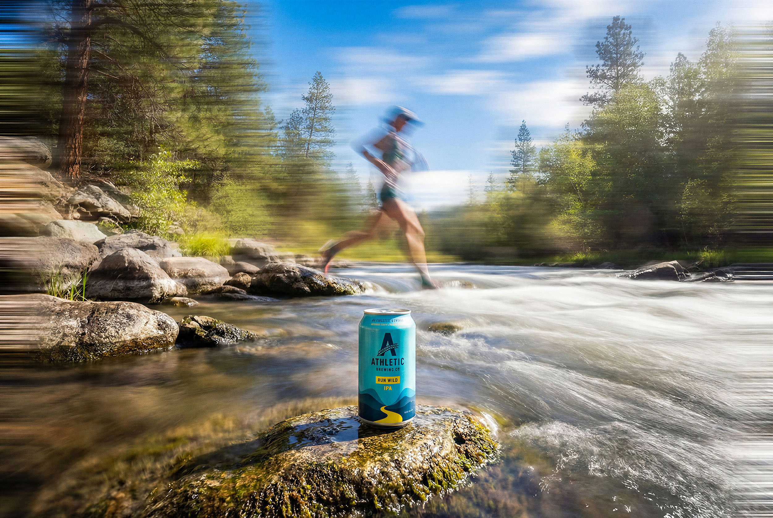
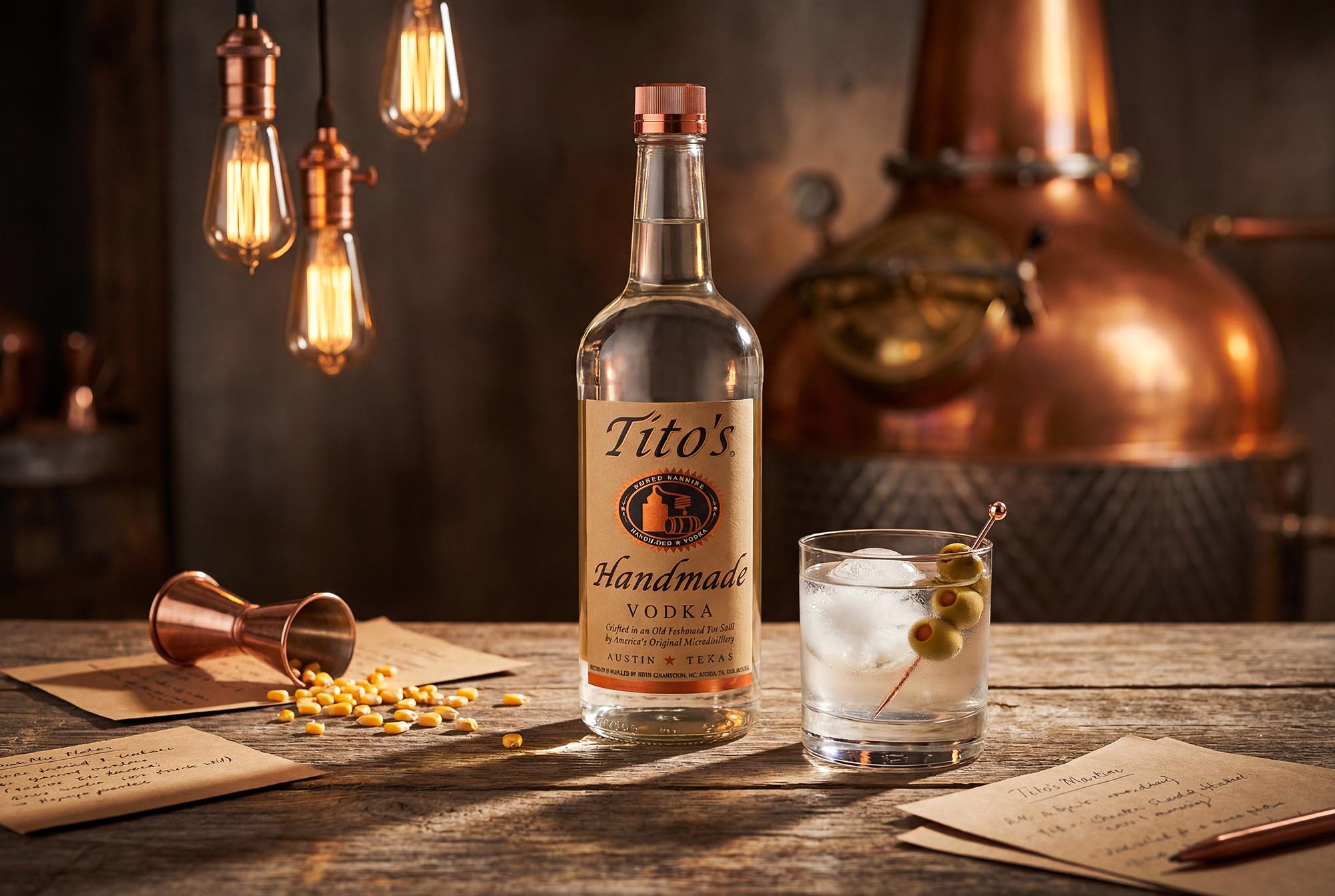
Lifestyle imagery tells stories that isolated product shots cannot. A glass of whisky beside a leather-bound book and reading glasses doesn’t just show the product—it suggests the experience, the moment, the lifestyle associated with premium spirits consumption.
The challenge with lifestyle dark spirits photography is avoiding cliché. Yes, whisky goes with leather, wood, and masculine accessories. But the world doesn’t need another spirits photo featuring a bottle next to a cigar and a pocket watch. Push beyond the obvious. Consider location, time of day, and story. What makes this particular spirit special? Is it the craftsmanship? The heritage? The innovation?
When we photographed Rémy Martin XO, we focused on the interplay between heritage and contemporary luxury—classic elements presented with modern sophistication. The composition included the bottle but emphasized the liquid’s color through careful pour shots and the craftsmanship through selective focus on the bottle’s details. Every element supported the narrative rather than distracting from it.
Technical Considerations for Different Spirit Categories
While the fundamentals remain consistent, different dark spirits categories present unique photographic challenges.
Whisky and Bourbon
Whisky bottles often feature elaborate embossing, traditional shapes, and labels rich with heritage branding. These details deserve attention in your photography. Side lighting can make embossed glass lettering pop, transforming what might be a simple bottle into something with genuine texture and interest.
The liquid color in whisky varies significantly by type and age. Single malts often show paler gold tones, while heavily sherried whiskies approach deep amber. Bourbon tends toward reddish amber. Your lighting setup might need adjustment between bottles to accurately represent these variations.
Cognac
Cognac photography demands sophistication. These spirits trade heavily on heritage, craftsmanship, and prestige. The bottles often feature elegant, classical shapes with minimal but refined labeling. Your photography should match this refined aesthetic.
Cognac’s color—ranging from pale gold (VS) to deep mahogany (XO and beyond)—tells a story about aging and quality. Capturing this color accurately is crucial. The liquid often shows beautiful gradient effects in the bottle, from lighter tones at the top to richer colors at the base. Proper backlighting reveals these gradients and adds visual interest.
Rum
Rum presents perhaps the widest variation in both bottle design and liquid color. White rums need completely different photographic treatment from dark aged rums. The bottles range from straightforward to highly theatrical, reflecting rum’s diverse cultural origins.
For dark aged rums, the photography often benefits from warmer, more tropical associations. Where whisky might pair with leather and wood, rum photography can incorporate more color, more warmth, and references to its Caribbean or Latin American origins. The liquid’s color in premium aged rums rivals cognac for depth and richness.
Post-Production: Enhancing Without Losing Authenticity
Even perfectly captured dark spirits photography benefits from thoughtful post-production. But there’s a crucial line between enhancement and fabrication. Your goal is to optimize what you captured, not create what wasn’t there.
Color Grading for Luxury Appeal
Color grading dark spirits imagery requires restraint. The temptation is to push the amber tones toward maximum saturation, creating liquid that glows like backlit honey. Resist this urge. Oversaturated spirits look artificial, reducing rather than enhancing perceived quality.
Instead, work with subtle adjustments to the orange and yellow channels, bringing the liquid’s warmth forward without making it garish. Often, the bigger impact comes from adjusting the shadows and mid-tones in the background, creating better separation between the bottle and its environment. A slight warming of the overall image can enhance the luxurious feel without touching the liquid’s color directly.
Retouching: What to Fix and What to Leave
Perfect bottles exist only in imagination. Real spirits bottles have minor scratches, dust particles, small imperfections in the glass. Professional photography requires addressing these issues without making the bottle look unnaturally perfect.
Remove obvious dust, fingerprints, and scratches that would distract viewers. Clean up the label if it has minor damage or printing imperfections. But leave the subtle texture of the glass, the slight variations in surface that confirm this is a real, tangible object. Over-retouching creates sterile, lifeless imagery that actually works against luxury positioning.
The Chronos Studio Approach to Dark Spirits Photography
Our work with brands like Rémy Martin and Hibiki has taught us that exceptional dark spirits photography requires both technical mastery and deep understanding of the product’s positioning. We don’t just capture bottles—we create images that communicate craftsmanship, heritage, and the promise of experience.
This understanding drives every decision in our process. The lighting setup for an XO cognac differs from that of a Japanese whisky because these spirits tell different stories. Rémy Martin speaks to French heritage and centuries of expertise. Hibiki embodies Japanese precision and harmony. The photography must reflect these distinctions.
We combine traditional photography expertise with advanced technology to deliver results that meet luxury brand standards while providing the efficiency modern marketing demands. Our process ensures consistent quality across entire campaigns, with the flexibility to create unlimited variations for different markets and channels.
Creating Images That Drive Desire
The ultimate goal of dark spirits photography isn’t technical perfection—it’s creating images that make people want to taste, purchase, and experience the spirit you’ve photographed. This requires moving beyond competent product photography toward imagery that genuinely resonates.
Think about the best spirits photography you’ve encountered. What made it memorable? Likely, it wasn’t just technical excellence, though that was present. It was probably the way the image made you feel—the suggestion of quality, the promise of pleasure, the association with a lifestyle or moment you aspired to experience.
Achieving this level of impact requires understanding your audience as deeply as your technical craft. Who buys this spirit? What motivates their purchase? What are they really buying beyond the liquid in the bottle? A $200 cognac isn’t just fermented grapes—it’s sophistication, celebration, achievement, gift-giving, and tradition. Your photography should acknowledge and enhance these associations.
Moving Forward with Your Dark Spirits Photography
Mastering dark spirits photography takes time, experimentation, and willingness to learn from failed attempts. Your first whisky bottle won’t look like your hundredth. But understanding the fundamentals—how light interacts with amber liquid, how to control reflections, how composition affects perception—accelerates the learning curve significantly.
Start with the basics: one bottle, one backlight, one edge light, one fill light. Master this simple setup before adding complexity. Understand how each light contributes to the final image. Experiment with positioning, intensity, and diffusion. Study the results critically, noting what works and what doesn’t.
As your technical confidence grows, push into more complex territory. Add environmental elements. Try unconventional angles. Experiment with color palettes and moods that challenge conventions. The goal isn’t different for the sake of different—it’s finding the approach that best serves each specific spirit and brand.
See Our Spirits Portfolio
Our work with premium spirits brands has generated some of our most compelling imagery. From the rich amber depths of Rémy Martin XO to the sophisticated minimalism of Hibiki Japanese Harmony, each project demonstrates our commitment to creating photography that honors both the craft of distilling and the art of visual storytelling.
If you’re looking to elevate your spirits brand imagery with photography that balances technical excellence and genuine aesthetic impact, we’d welcome the conversation. See more of our spirits photography work or get in touch to discuss your specific needs.


