[Case study] Style Study — uncommissioned ✦
Golden hour.
A self-initiated study in warm light, restraint and product fidelity.
✦ Style Study — self-initiated concept work. Not affiliated with, endorsed by, or engaged by Aplós.
[01]The study
- Still life
- Golden hour
- Product fidelity
- Motion
The study
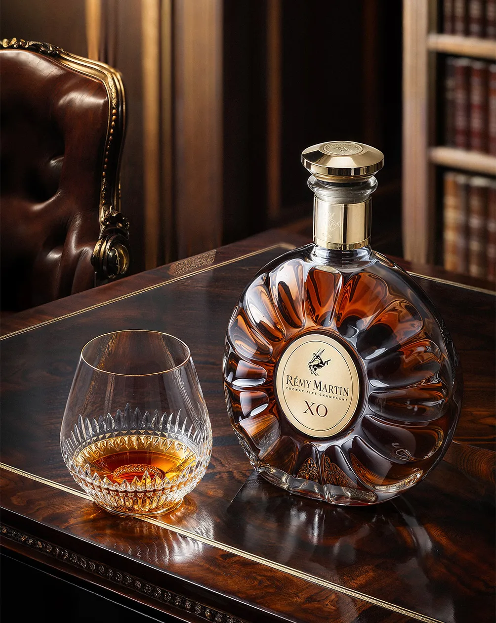
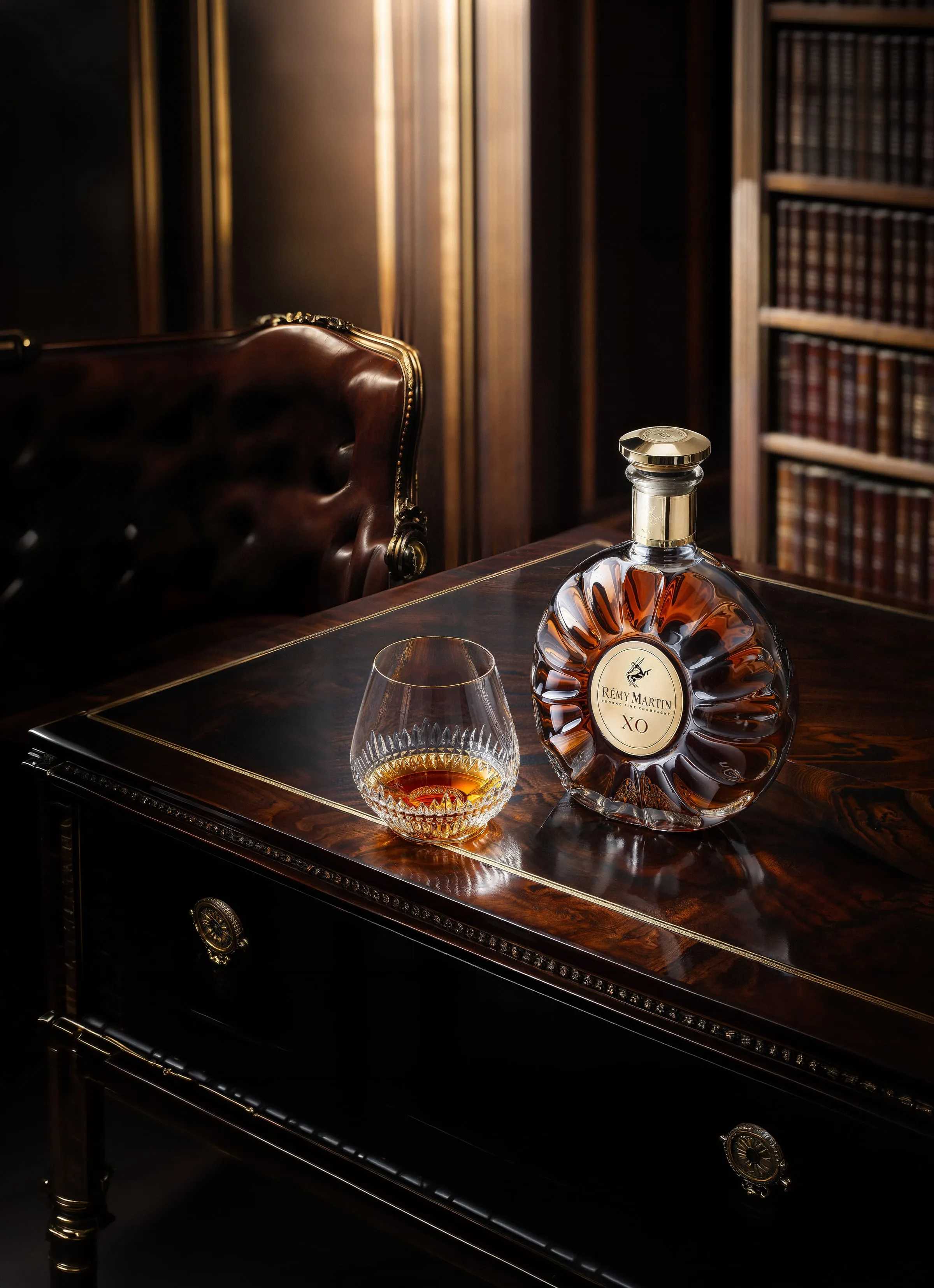
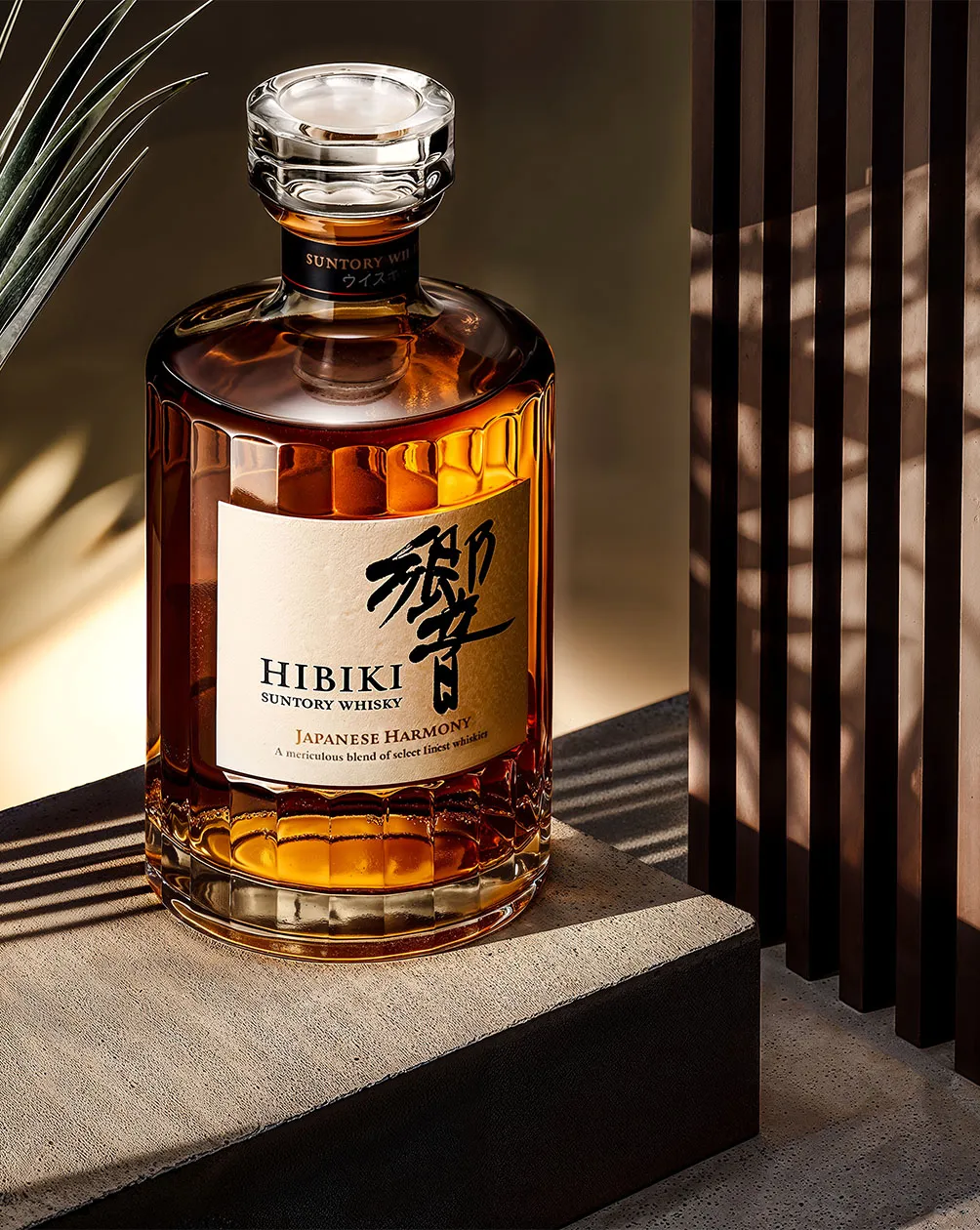
Premium drinks photography has a default setting: dark wood, low key, amber pooling in a heavy glass. It is a beautiful language — and for a growing category, entirely the wrong one.
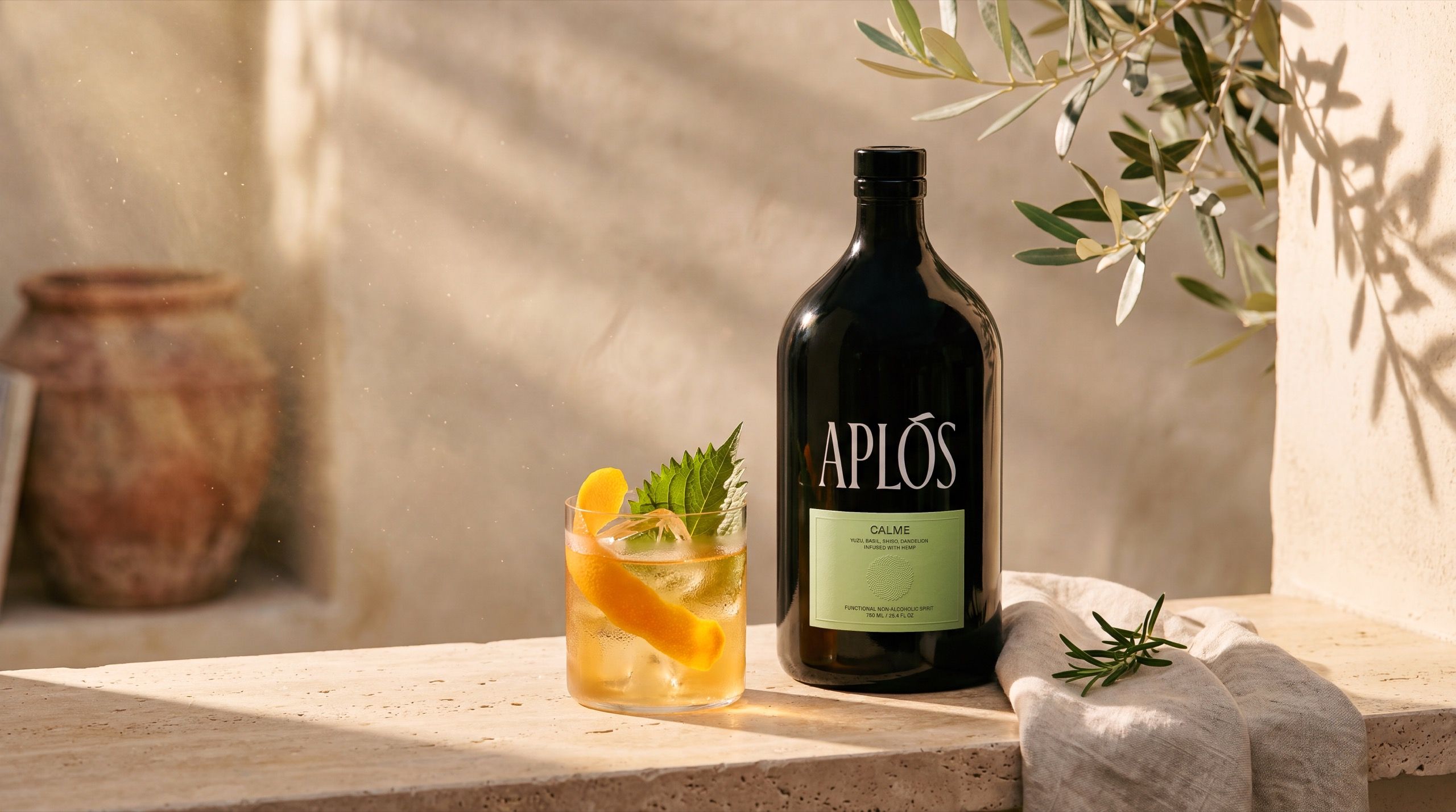
The functional non-alcoholic movement is not selling the end of the night. It is selling the part of the day you actually remember. Photographed in the dark cabinet, a bottle like this reads as a mimic; photographed at five in the afternoon, it reads as itself. So we set ourselves a brief nobody asked for — build a complete golden-hour campaign for a functional non-alcoholic spirit, and make the light do the storytelling.
[02]The idea
Three rules,
and no breaking them.
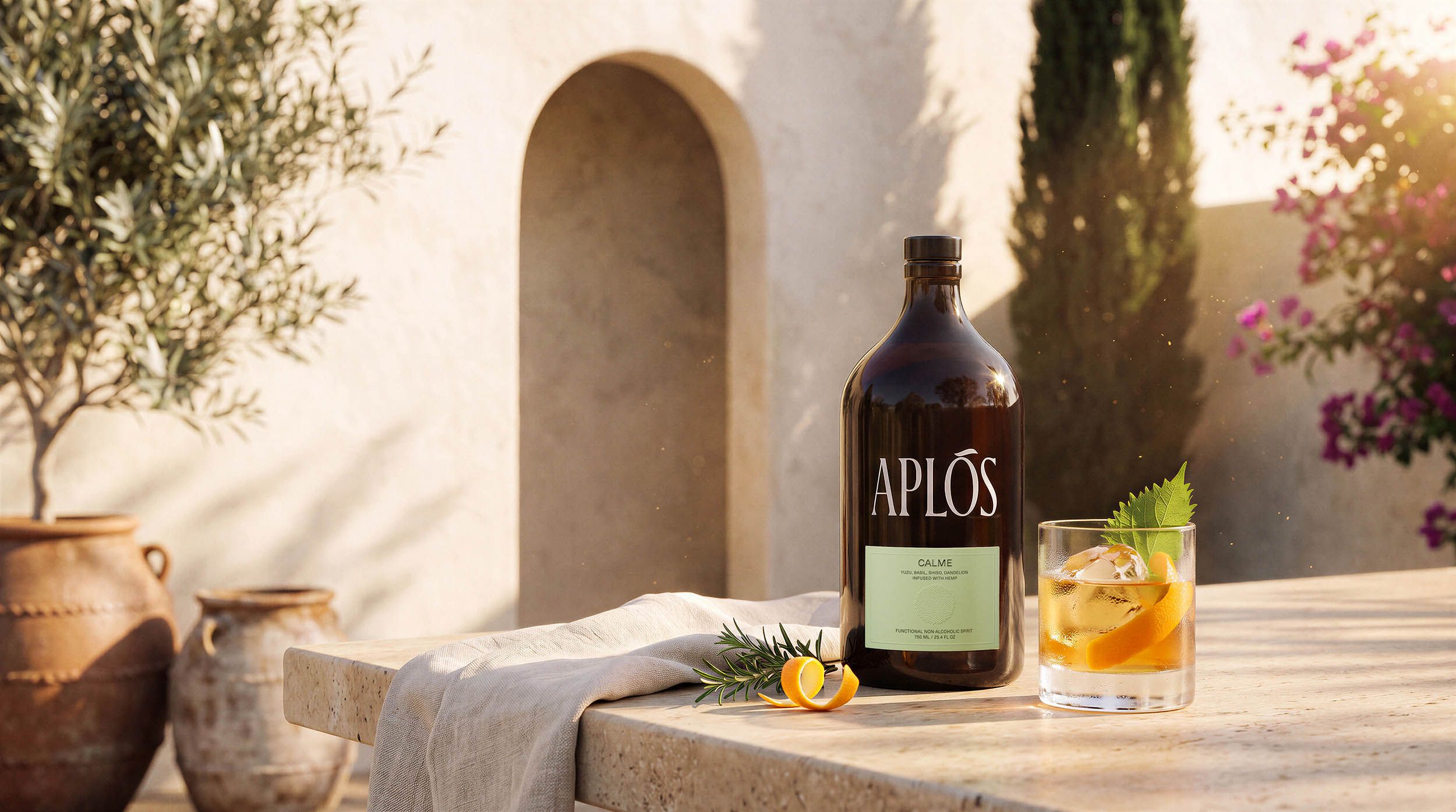
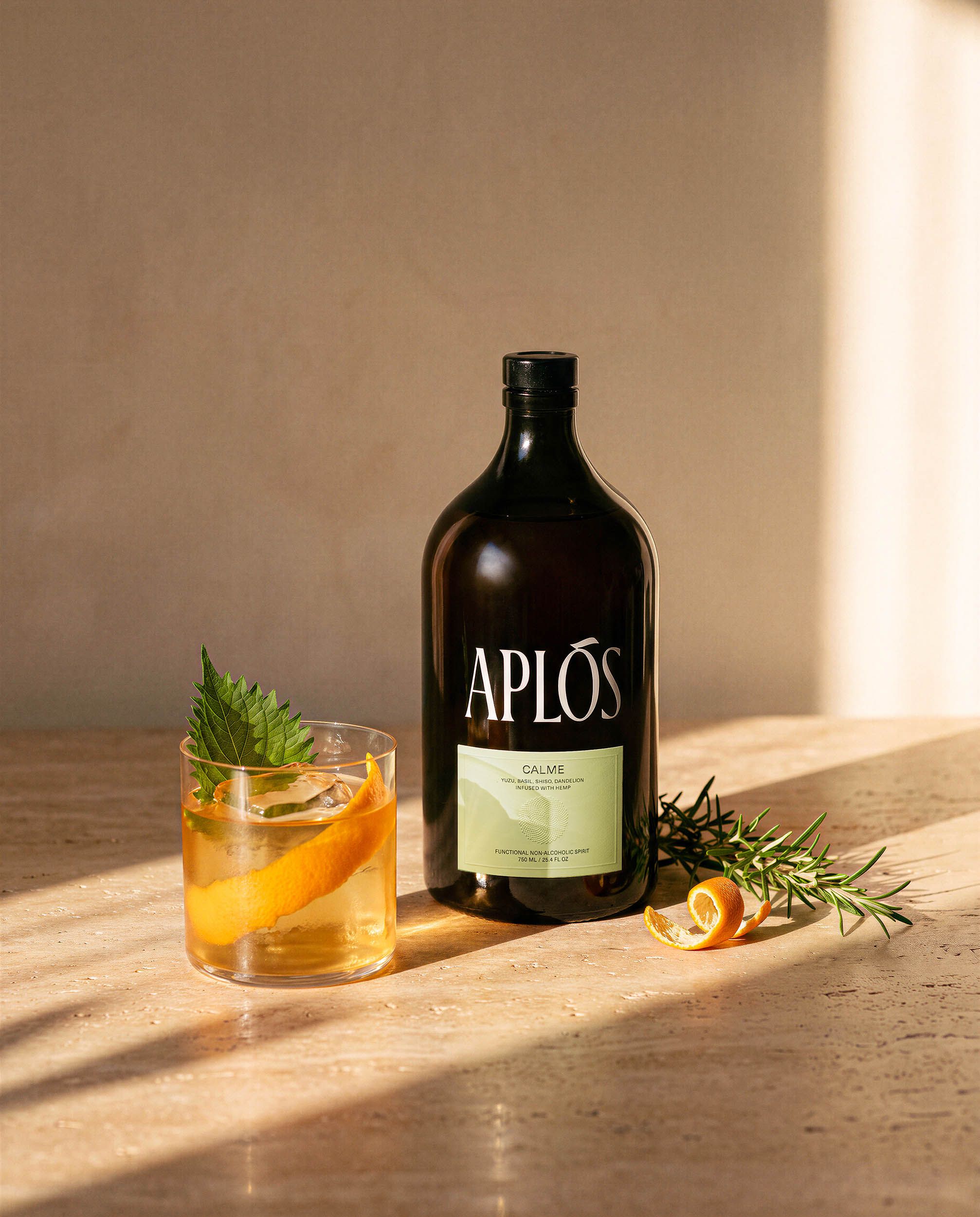
Golden Hour is not a lighting choice — it is the product’s actual occasion. Everything in the series follows from that one decision.
- [No. 01]
One sun
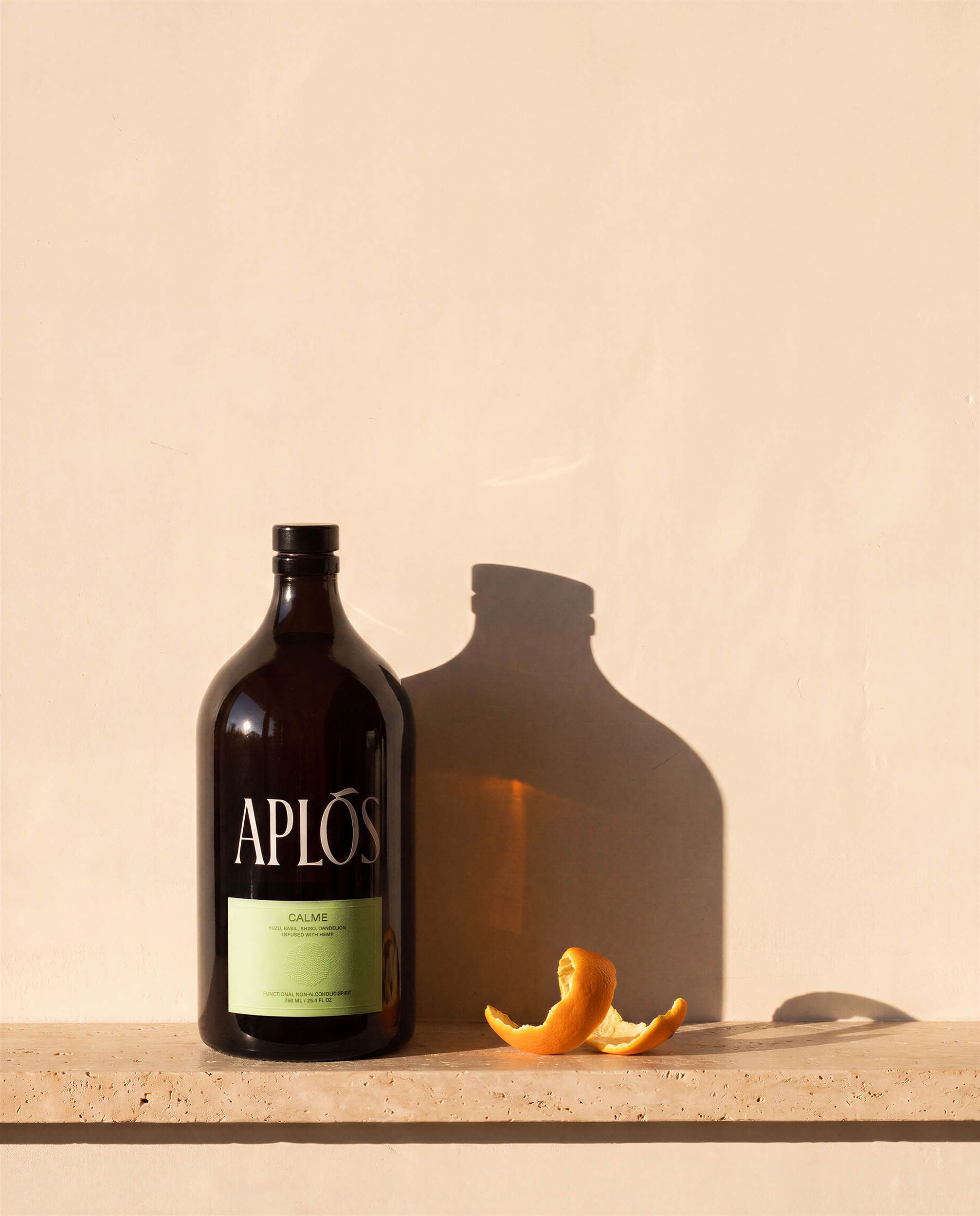
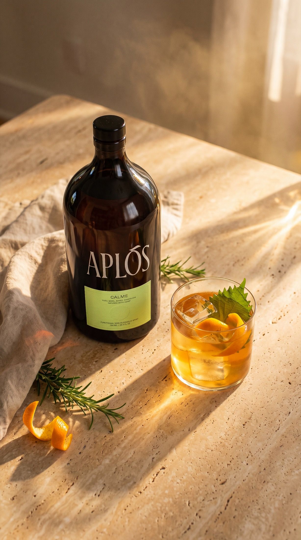
A low sun, always entering from the right, in every frame. Shadows fall the same way across nine images — the discipline most easily lost the moment generation replaces a set.
- [No. 02]
One serve
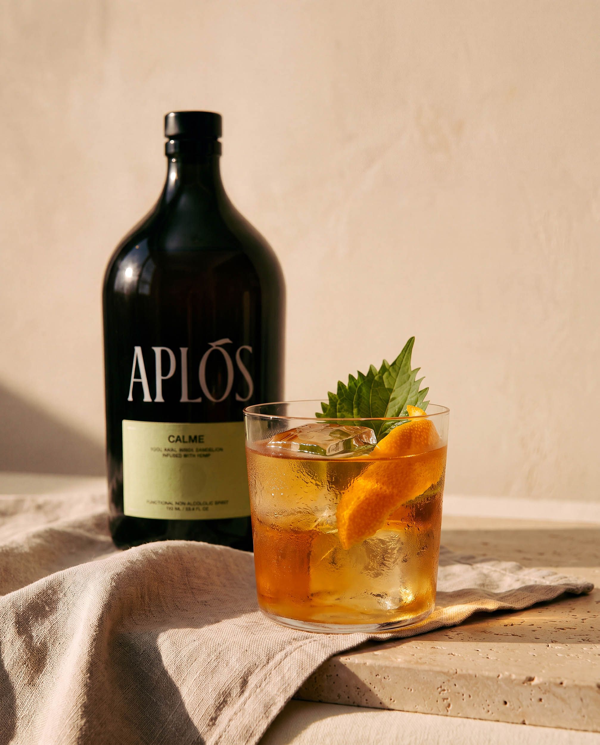
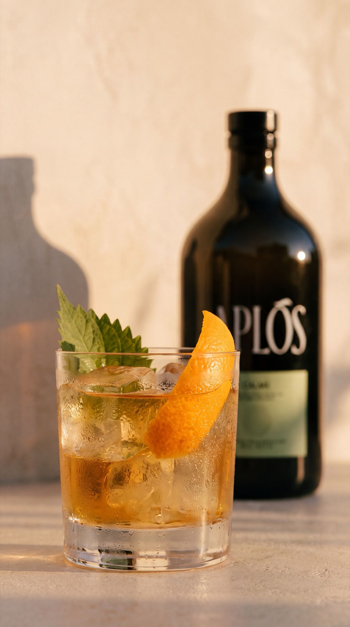
The same lowball, the same hand-cut ice, the same wide ribbon of mandarin peel and single shiso leaf — carried from the hero to the macro. A repeated detail is a signature.
- [No. 03]
One material palette
Honed travertine, bone-cream tadelakt plaster, raw linen. Terracotta, cream, sage, amber. Nothing thematic, nothing literal — the product is the only thing in the frame that needs to be specific.
[03]The frames
One afternoon,
nine ways.
[04]The motion frame
All the movement,
none of the agitation.
The hero, gently animated — a slow push in, a breeze through the olive branch, dust suspended in the sunbeams. The bottle itself locked, absolutely still. Scroll to move it.
[05]Built for stories
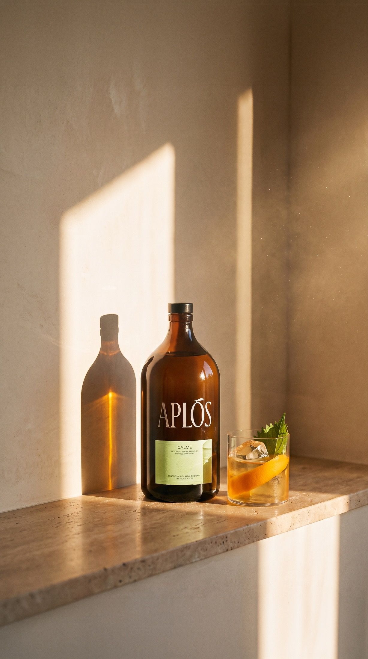
Composed vertical,
not cropped into it.
Different beats from the feed set, with the top and bottom of each frame kept quiet so the interface never eats the product.
[06]The craft
Nine frames
that belong together.
Label fidelity
Typography is the first thing to soften, drift or quietly re-letter itself, and a label that is almost right is worse than no image at all. Every frame holds the bottle upright, undistorted, square to the light, with the label legible and unchanged. Where a frame did not hold, we generated it again rather than retouching it back into shape.
One light, defended
Choosing a single light direction and defending it is the whole game. A low sun on the right, in every frame, is what separates a campaign from a folder of nice pictures — the difference between images that came from the same afternoon and images that merely resemble each other.
Restraint over literalism
No prop reaching for “wellness”, nothing that explains the concept. The background stays atmospheric enough to feel like a place and vague enough to never compete. The technology is not the interesting part; the editing-down is.
[07]What it took
No studio.
No crew. No sun to wait for.
Nine campaign-grade frames and one motion asset, built to a self-assigned brief — no location scout, no permits, no product handling, no waiting for the actual sun to be in the actual right place.
The savings do not come from removing expertise; they come from removing physical production overhead. The creative direction, the material palette, the decision to put the sun on the right and leave it there — that is the same work it has always been, done by the same kind of people. The generation model is the cheapest line on the invoice.
For a real engagement, this study is roughly the first afternoon
Your category’s
world, relit.
A commissioned series starts with a brief and a style lock. First drafts land within 48–72 hours, product fidelity is held to the label, and the style library we build with you stays yours to extend season after season.
[08]FAQ
Straight answers.
- Is this a client project?
- No. This is an uncommissioned Style Study — self-initiated concept work produced without a brief, without client involvement, and without any affiliation with the brand shown. We publish studies to demonstrate our creative approach, not to imply a relationship.
- What is a Style Study?
- A Style Study is a speculative creative exploration Chronos Studio produces on its own initiative: we choose a brand or category, set ourselves a brief, and build a complete campaign to see where the idea lands. Client work is labelled separately and always shown with the client’s knowledge.
- How is a golden-hour series like this produced?
- Through AI-assisted production under human creative direction. The creative direction, palette, lighting logic and quality control are ours; generation replaces the physical set, not the expertise. No studio, crew or product shipping is involved.
- How is product fidelity maintained?
- The product is held to its reference throughout: label artwork, typography, proportions, cap and fill level remain exact and legible in every frame. Frames that fail fidelity are regenerated rather than retouched.
- How long does a commissioned series take?
- First drafts are delivered within 48–72 hours of a locked brief.